

The Norman door: why good people fail because of bad processes
When employees fail at a process, the employees are rarely to blame. Why bad workflows behave like doors that invite you to pull when they mean push.

 Digitalisation
You know the moment. You walk up to a glass door, grab the handle, pull with a swing, and nothing happens. The door needs to be pushed. A quick glance to the side to check whether anyone saw, then you push.
The interesting part is not the door. It is your first reaction: “What an idiot I am.” You blame yourself. Yet the fault lies in the thing. A handle is an invitation to pull. Anyone who puts a handle on a door that wants to be pushed has cast a contradictory promise in metal and is then surprised that people fail at it.
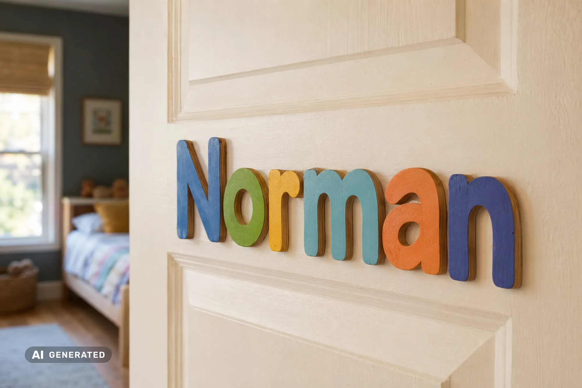
This door has a name. The cognitive scientist Don Norman used it as an example so often that it is now named after him: the Norman door. And once you know how it works, you see it everywhere. Above all where it gets expensive: in your products and in your processes.

The principle in one sentence
A Norman door appears when something signals one thing and demands another. The handle says “pull”, the mechanism says “push”. The signal lies, and because we trust signals more than what lies behind them, we walk into it again and again.
The real damage is not the embarrassment at the door. It is that we look for the blame in the wrong place. Not in the badly made thing, but in ourselves.
And this very error of thinking gets really expensive in a company. Because there it is no longer called “What an idiot I am”. There it is called: “The new colleague just doesn't get our system.” Or: “Our customers are too impatient for our portal.” As soon as someone takes the blame for a mistake that was really provoked by a badly built product or a badly thought-out process, you pay twice: once in lost time and once in the wrong diagnosis. You think your people are the problem, when it is your workflows.
Three places where Norman doors cost money
1. In the product your customers or employees use
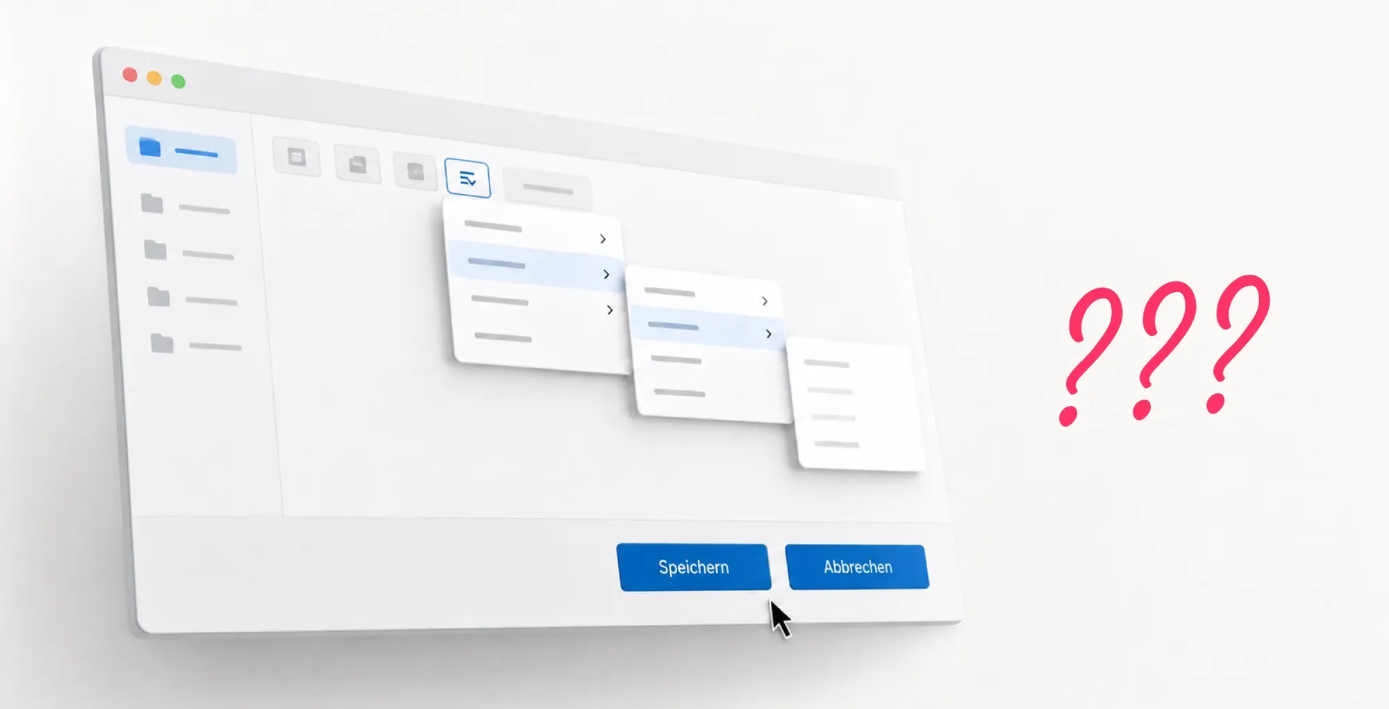
This is the familiar case. A piece of software, an app, an ordering portal, a machine control system. The “Save” button looks like the “Cancel” button and sits right next to it. The action that really matters is disguised as inconspicuous text that nobody takes for a button. The function needed every day hides three menus deep.
You know the result from every support ticket that starts with “doesn't work” and ends with “oh, I see”. The user did nothing wrong. The product signalled the wrong thing. With an internal tool, that costs you working time. With a product your customers pay for, it costs you customers.
2. In the analogue process that “we've always done this way”
Norman doors don't need a screen. The holiday request form that asks at the top for information you only know at the end. The approval process that needs three signatures in an order written down nowhere, so every request comes back at least once. The procedure that only Ms Berger from accounting really understands, which is why the whole place grinds to a halt when Ms Berger is on holiday.
Processes like these look self-explanatory and aren't. You have to know the trick. And the trick lives in the heads of a few long-serving staff, not in the process itself. If a new employee needs weeks to learn something that should really take minutes to explain, you don't have difficult new employees. You have a Norman door without a door handle.

3. In the digital solution that only makes the bad process faster
The most expensive case of all, because it looks like progress. A company digitalises a cumbersome paper process and rebuilds it one to one. The confusing form becomes a confusing PDF form. The opaque approval process becomes an opaque workflow in the new system, now with a login.

Why nobody notices for years
You might think something like this would be noticed immediately. It isn't, and there are two uncomfortable reasons for that.
The first is the curse of knowledge. Anyone who builds a product or introduced a process knows every step, every hidden function, every unwritten rule. To that person everything is obvious, and that is exactly why they are the worst tester of their own work. The Norman door never comes from stupidity. It comes from familiarity. The person who designed the door naturally knows that you push.
The second reason is that you only see the problem indirectly. Nobody reports “our process signals the wrong thing”. You see support requests, longer onboarding times, careless mistakes, the note on the monitor with handwritten instructions, the unofficial Excel file next to the official system. These are all symptoms of the same thing. Your people quietly work around a door they cannot open, and blame themselves while doing so.
If you hear one of these sentences in your company, it is worth taking a second look: “You just have to know that here.” “We have a trick for that.” “New people take a while to get the hang of it.” That is rarely a staffing problem. Most of the time it is a Norman door.
What this has to do with us
The good news: Norman doors are not a law of nature. They appear where signal and function drift apart, and they disappear when you bring the two back into line. That is exactly the task of good UX design, and not a cosmetic one.
At Werkdigital, a UX team sits between our developers and project managers, and its job is not to make screens pretty. Its job is to prevent people from failing at your product or your process. Before a single line of code is written, we clarify the uncomfortable question: does it signal what it does? Does the workflow lead the user where she wants to go, or does it force her to know a trick?
That is why we don't start with technology but with your problem. We take you by the hand, look at your processes and products and search for the Norman doors before they are cast in software. Only then do we build, as a bespoke solution that fits your company, not as off-the-shelf software you have to adapt your company to. For more than 15 years, with a dedicated team of designers, developers and project managers in Germany. With a success guarantee. For success stories.

A Norman door is a design example from the cognitive scientist Don Norman: a door whose design signals one action (for example a handle for pulling) although another is needed (pushing). More generally, the principle describes products and processes whose outward signals don't match their actual function. Users don't fail through clumsiness but because the design lies, and they still blame themselves for it.
UX design decides whether employees and customers can use your software every day without problems or whether they fail at it. In medium-sized businesses, poor UX shows above all in longer onboarding times, growing support effort, operating errors and shadow solutions such as unofficial Excel files next to the actual system. Good UX design reduces these hidden costs because it brings signal and function into line before the software goes live.
Typical signs are recurring sentences such as “You just have to know that here”, “We have a trick for that” or “New people take a while to get the hang of it”. Handwritten notes on monitors, unofficial Excel spreadsheets alongside the official system, many queries about the same procedures and long onboarding times are also clear symptoms. The real problem usually lies not with the employees but in a process that requires insider knowledge it doesn't itself convey.
Digitalisation projects rarely fail because of the technology. They fail because an existing, poorly thought-out process is transferred one to one into software. An unclear paper process becomes an unclear workflow in the new system, only faster and active around the clock. Successful digitalisation therefore starts before the first click: processes are understood, questioned and rethought before they are translated into a bespoke software solution.
The costs are rarely visible in a single invoice, but they add up quickly: longer onboarding for new employees, recurring support tickets, operating errors and the rework that follows, customers abandoning badly designed portals, and revenue that never materialises because prospects can't find the next step. Anyone who adds up these hidden costs once will find that good UX design is not a cosmetic expense but a direct lever for productivity, satisfaction and conversion.
Let us talk about your ideas and challenges, in a relaxed way.
Book an initial assessment
We value your privacy
We use cookies and other technologies on our website. Some of them are technically necessary, while others help us to improve this website and your experience. You can accept all cookies or adjust your settings individually and reject non-essential cookies.