
When the preview decides: the art of making people want the project
Why decision-makers are rarely won over to software projects by technical arguments, but by presentable images, designs and device shots that make impact and benefit visible at an early stage.

 Strategy
The projector hums. Slide 37 shows a system architecture that ought to warm the heart of any software developer. Clean interfaces, scalable infrastructure, a database that would greet the next growth spurt with a shrug. The technical director speaks with the quiet enthusiasm people develop when they know something has been genuinely well thought through.
At the other end of the table sits the management. They nod. Politely, attentively, entirely unmoved.
Then something almost impertinent happens. Someone opens a laptop and shows the first designs. A start screen, two core workflows and device shots in which the planned software can already be seen on smartphone, tablet and desktop. None of it works yet. Even so, the chairs move closer to the table. A hand points at the screen. “So this is how our customers could use it?” Another voice asks: “Can we put this view into the presentation?” Listeners become contributors. A technical possibility becomes a visible project.

What the architecture could not achieve in 37 slides, five images achieve in less than three minutes. They give the idea a face and leave people wanting more.
You could say: the preview decided.
People buy visible promises
This is not to belittle the technology. Without it, the finest design remains an attractive claim. But at an early stage of a project, technical quality has a communication problem. You can explain it, test it and calculate it. What you can hardly do is look at it.
Decision-makers are therefore not thinking less well or more superficially when they respond more strongly to a mock-up than to an architecture diagram. They are thinking in a different language. Their first question is not how elegantly a system is built. They want to know what it will change. Will sales become faster? Will customers find their way around more easily? Will the effort spent on coordination fall? Is this a product that can be brought to market with a clear conscience?
Technical arguments describe the foundations. A good design shows the house.
This matters, because people are rarely inspired by an abstract possibility. They are inspired by a picture in which they recognise themselves. A device shot of the future app can do more in this respect than half an hour on interfaces. Not because the image is more important, but because it opens a door. Behind it, you can see how the idea might later work in everyday business, for customers or in the next presentation.
The long history of the preview
The idea of showing something before it exists is older than software development.
Renaissance architects built models from wood, plaster or wax. Not because princes and city councillors failed to understand the difference between load-bearing structure and façade. They wanted to see what they were deciding on. A dome at a scale of 1:20 turned mathematical calculations into a promise you could walk around.
Centuries later, cinema invented the trailer. Nobody would think of explaining every twist, line of dialogue and shot before a film. You show two minutes. A mood, a conflict, a face in the right light. Enough for the audience to want to know what happens next. The trailer is not the film. But it lets the film begin in the viewer's mind.
Even the furniture shop has grasped this principle. Nobody buys a sofa because the price tag says “high-quality cold foam core”. You sit down. You lean back. For a brief moment, you imagine the sofa in your own living room. Trying out a sofa in the showroom is perhaps the most ordinary form of the preview, but it works reliably.
People have always bought visible promises. Software is no exception. It has simply pretended for a long time that a good explanation ought to be enough.

A good preview does not show everything
The first images from an analysis package are not meant to pass themselves off as finished software. That is precisely where their art lies. They show enough to create an impact and remain open enough for the direction to be discussed.
If a design is too rough, it remains a sketch that everyone interprets differently. If it already looks like a finished product, it quickly creates a false impression of how far the project has come. Good presentation designs sit exactly in between. They have direction, but no vanity yet.
Device shots are particularly effective. They do not just show a single screen, but place the idea in its later context. The app appears on a smartphone, the application on a tablet or desktop. An abstract description becomes an image that can be used in a presentation and carried further within the organisation.
After all, terms such as “intuitive”, “clear” or “modern” create at least seven ideas in the minds of five people. In a meeting, everyone can agree and still be talking about different products. Only when something appears on the screen do the differences become visible. One person expects a dashboard, another a guided workflow. For sales, everything has to be quick to grasp; for the management, the benefit has to be clear at first glance.
The images put an end to this polite ambiguity. They give the project a shape before a clickable prototype is created in the next step.
Why early images are more honest than late presentations
At first, it sounds paradoxical: a few designs that cannot do anything technically are supposed to be more honest than a detailed presentation?
Yes, because they lay themselves open to criticism.
A presentation can elegantly circle around gaps. It speaks of a “central user interface”, a “seamless customer journey” or “efficient process support”. That sounds sensible and remains comfortably without consequence. A design has to become more specific. Where does the journey begin? What does the user see first? What information is missing? What happens after the click?
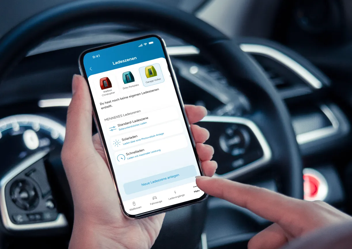
As soon as these questions are answered on a screen, you can check whether the idea works. Not at some point after months of development, but before the first large invoice has been written.
This is more than design. It is risk management by visible means.
The earlier a mistake is spotted, the lower its price. A misunderstood direction can be changed in an early design with a few adjustments. In a later prototype, let alone a fully developed application, it drags workflows, logic and tests along with it. A small correction then quickly turns into open-heart surgery on the system.
So showing something early is not deception. It prevents everyone involved from having deceived themselves later on.
When an internal tool suddenly became a shared project
A medium-sized company came to us with an idea that had long been considered necessary internally. Information from several departments was to be brought together in a dedicated application. The benefit was plausible, and so was the technical feasibility. Even so, the project was going nowhere.
In our conversations, it quickly became clear why. Each department had a different idea of the same application. For the management, it was a steering instrument. Sales expected faster answers. The staff in administration mainly hoped they would finally no longer have to switch between spreadsheets and emails. Everyone was in favour of the project. Just not the same one.
As part of an analysis package, the first thing produced was therefore not a functional specification, but presentable visual material. A start screen, first designs and device shots for smartphone, tablet and desktop. Nothing had been programmed yet, and a clickable prototype was deliberately not part of this phase. But for the first time, everyone could point to the same thing.
That changed the conversation. “We need a central solution” became “The approval step is missing here”. “It has to be easy to use” became “This information belongs at the top”. The management recognised the impact the application could have in everyday work. The specialist departments saw where their workflows did not yet fit together. And the project team gained something that no technical specification alone would have produced: a shared picture.
The design was not the result of the project. It was the moment the project actually began.
This is exactly where the value of our analysis packages lies. Medium-sized businesses do not just receive a description of what could be built. They receive first images, designs and device shots of their planned software or app. This material can be used in internal presentations, creates a shared understanding and gives the management a tangible basis for decisions. The clickable prototype is then the next step, not the result of the analysis phase.
“But isn't that just a façade?”
The objection is justified. The software world has produced plenty of shiny surfaces with things creaking behind them. Anyone who has once fallen for an impressive demo looks at attractive screens with healthy scepticism.
Design must therefore never replace technology. It has to translate it.
A good translation does not reinvent the content. It makes it understandable for someone who does not speak the source language. This is exactly what design achieves at an early stage of a project. It translates data structures into information, processes into user journeys and technical possibilities into a recognisable impact.
A façade hides what lies behind it. Good presentation material makes visible what is to be created. It does not just show an attractive surface, but translates benefit and direction into a form that decision-makers can talk about. The deeper workflows and open questions are then worked out further in the concept and prototyping phases.
This is why design and technical concept belong together. One makes the benefit visible, the other ensures that it will hold up later. Those who only design may promise something that cannot sensibly be built. Those who only plan technically risk a solution whose quality nobody recognises, because it misses everyday reality.
The preview has succeeded when it does not distract from the substance, but prepares the way for it.

The moment a project gets its chance
Back to the meeting room. The projector is still humming. The system architecture is no less brilliant than before. It has simply stopped standing alone in the room.
The screen now shows what it is needed for. The management is no longer debating whether the project might make sense in the abstract. It is talking about concrete workflows, about customers and about the benefit to the company. The technical concept has been given a face.
It is precisely this moment that decides projects more often than many requirement specifications would suggest. Not because decision-makers are dazzled by pretty pictures. But because they can finally see what they are deciding on.
Anyone who wants to get a project approved should therefore not begin with the longest explanation. They should show something that keeps working in the other person's mind.
First make people want the project. Then it gets serious.
The analysis package produces first images and designs of the planned software or app. Depending on the project, these also include device shots showing how the solution could later look on a smartphone, tablet or desktop. The main purpose of this material is to make the idea understandable and presentable internally.
A device shot places a software design within the frame of a specific device. Instead of a free-standing user interface, the viewer sees, for example, an app on a smartphone or a web application on a laptop. This makes the planned solution more tangible and is particularly suitable for presentations.
No. The analysis package provides the content basis as well as first images, designs and device shots. A clickable prototype is the next project step. In it, selected workflows and interactions are connected so that later use can already be tried out.
They create a shared picture. Management, specialist departments and IT no longer have to talk exclusively in abstract terms, but can assess a visible direction. The material can also be used directly in internal presentations to convey the benefit and target vision of the project.
No. The images translate the idea into an understandable form, but replace neither technical planning nor prototyping. They ensure that decision-makers can recognise early on what they are talking about. On this basis, the next steps can be planned on a sounder footing.
Let us talk about your ideas and challenges, in a relaxed way.
Book an initial assessment
We value your privacy
We use cookies and other technologies on our website. Some of them are technically necessary, while others help us to improve this website and your experience. You can accept all cookies or adjust your settings individually and reject non-essential cookies.